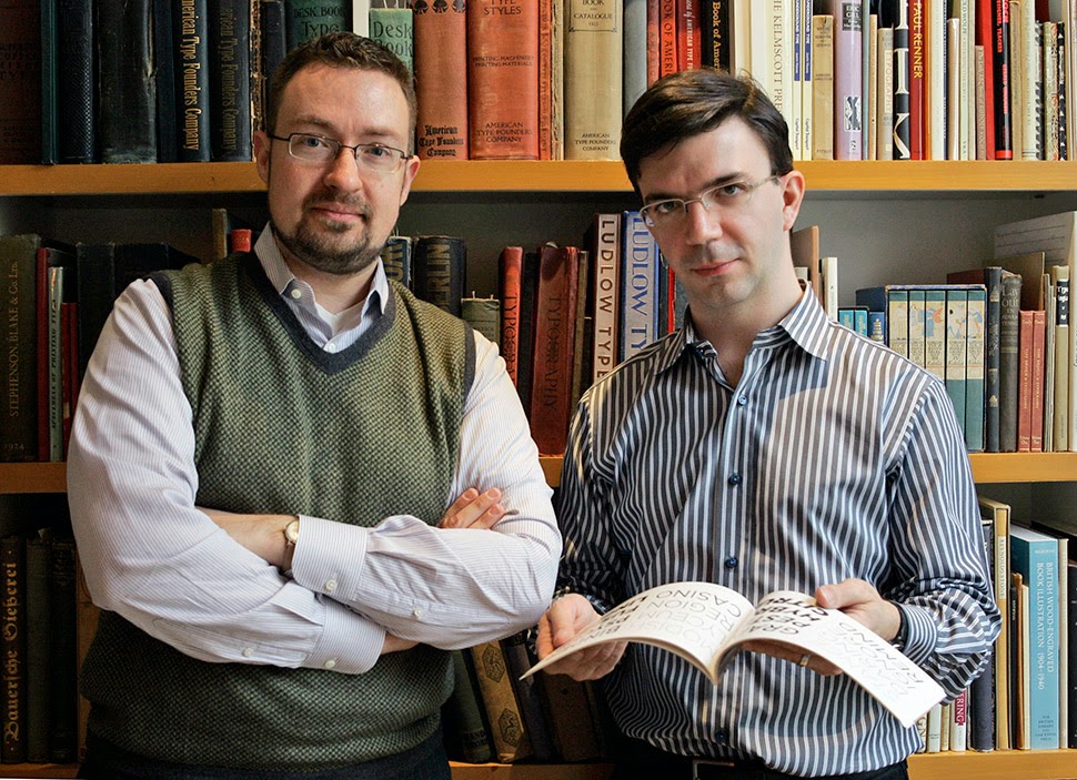
Gotham is one hell of a typeface. Its Os are round, its capital letters sturdy and square, and it has the simplicity of a geometric sans without feeling clinical. The inspiration for Gotham is the lettering on signs at the Port Authority, manly works using “the type of letter that an engineer would make,” according to Tobias Frere-Jones, who is widely credited with designing the font for GQ magazine in 2000. Critics have praised Gotham as blue collar, nostalgic yet “exquisitely contemporary,” and “simply self evident.”
 It’s also ubiquitous. Gotham has appeared on Netflix envelopes, Coca-Cola cans, and in the Saturday Night Live logo. It was on display at the Museum of Modern Art from 2011 to 2012 and continues to be part of the museum’s permanent collection. It also helped elect a president: In 2008, Barack Obama’s team chose Gotham as the official typeface of the campaign and used it to spell out the word HOPE on its iconic posters.
Among those who draw letters for a living, Gotham is most notable for being the crowning achievement of two of the leaders of their tribe, Frere-Jones and Jonathan Hoefler. The two men seemed to be on parallel paths since the summer of 1970, when they were both born in New York. Hoefler and Frere-Jones were already prominent designers when they began operating as Hoefler&Frere-Jones in 1999, having decided to join forces instead of continuing their race to be type design’s top boy wonder. Each would serve as an editor for the other, and they would combine their efforts to promote the work they did together.
Colleagues still struggle to explain what a big deal this was at the time. Debbie Millman, president emeritus of AIGA, the major trade organization for graphic designers, begins by comparing them to John Lennon and Paul McCartney, then stops. “They were famous before they got together, so that’s how they’re not like the Beatles. It’s more like Crosby, Stills, Nash & Young,” she says, before pausing again. “You know what—I’ll tell you what they were like. They were like Angelina Jolie and Brad Pitt.”
For 15 years, Frere-Jones and Hoefler seemed charmed. They made typefaces that rendered the stock charts in the Wall Street Journal readable and helped Martha Stewart sell cookbooks. They created an alphabet for the New York Jets, based on the team’s logo. And they saw their lettering chiseled into stone as part of the rebuilding of the World Trade Center. Last year, the duo won the AIGA Medal, the profession’s highest award. It seemed to be one of those rare situations whereby two successful soloists had combined to make an even better supergroup. Hoefler was asked if there were any troubles in their working relationship for a video produced for the AIGA in 2013. “We do have a longstanding disagreement over the height of the lower case t,” he said. “That is the only point of contention.”
Not quite. In January, Frere-Jones filed a lawsuit against Hoefler, saying that their company was not actually a partnership, but a long con in which Hoefler had tricked him into signing over the rights to all of his work, cheating Frere-Jones out of his half of the business. “In the most profound treachery and sustained exploitation of friendship, trust and confidence, Hoefler accepted all the benefits provided by Frere-Jones while repeatedly promising Frere-Jones that he would give him the agreed equity, only to refuse to do so when finally demanded,” the complaint charges. Frere-Jones is asking a court to grant him $20 million. Hoefler won’t comment on the suit directly, but the day after it was filed a lawyer for the company issued a brief statement disputing the claims, which, it said, “are false and without legal merit.” (About Gotham’s creation, Hoefler writes in an email: “No one is disputing Tobias’s role in those projects, or my own, for that matter. [Our] typefaces have had a lot of other contributors, as well — everything we do here is a team effort.”) According to the company statement, Frere-Jones was not Hoefler’s partner but a “longtime employee.”
by Joshua Brustein, Bloomberg Businessweek | Read more:
Image: Kathy Willens/AP