Young designers trained in Germany and Europe returned to Japan and produced elegant advertising for large companies such as Shiseido. Local artists and painters were both influenced by these national brands and spurred to produce more original designs. Many of these designs still showed the asymmetry and stylized flat shapes typical of Japanese woodblock prints. Some had amazingly clever use of only red and black ink colors while others used gold and silver metallic inks to add to their palette.
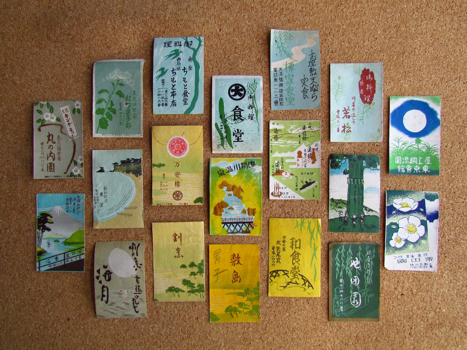
The Japanese matchbox labels are breathtaking in their stark beauty and simplicity: just a hand holding a glass or a dancing figure frozen in time. They were only low end ephemera but their reflection on the culture that produced them speaks of a world long gone.
by Arnon Reisman, A Phillumenist | Read more:


