Once upon a time, we had products that were colorful, in shapes that were quirky, whimsical, and expressive. Interesting! And then, almost every tech product became white, silver, gray, black, flat, square, round, and minimalist. Boring.
But there are hints that this is changing. And one of the leaders of this change is, somewhat improbably, Google.
 Anybody who’s been paying attention knows that Google has been pretty serious about hardware for a while, and at least as serious about doing quality design in hardware, software, and overall experiences. What fascinates me is the unexpectedly expressive direction the company has taken with its design language.
Google’s emerging design language (obviously still a work in progress) is reminiscent of the Italian branch of industrial design, which we haven’t seen much of in the last two or three decades. Instead, the German branch has dominated. It’s characterized by clean geometric shapes (cubes, cylinders), white and black glossy colors, and smooth unadorned surfaces. Think Bauhaus and — especially — Braun.
It’s a cliché at this point to draw parallels between Braun and Apple’s design languages. But nevertheless, aside from its own diversion into the more expressive realm of Italian-inspired design in the 2000s (original iMac, toilet-seat-shaped original iBook, etc.), Apple has hugely influenced other tech companies to follow the minimalist, German-flavored tradition.
This isn’t a knock against the Braun style — there are many beautiful products that have sprung from that well. It’s just that diversity is the spice of life, and tech products have become too much of a monoculture, stylistically. (...)
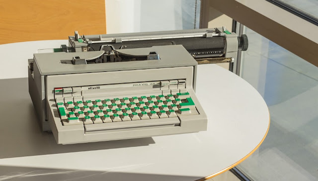
With Google’s launch of the Pixel 2 phone, wireless earbuds, VR headsets, Clips camera, and Home products, I was delighted to see touches of color and form that can clearly be traced back to the Italian branch of design, circa 1960s and ’70s. In particular, the pioneering company Olivetti — most well-known for its famous Valentine typewriter — but which had an incredible run of groundbreaking designs, including the world’s first programmable desktop computer (the Programma 101 of 1964).
But there are hints that this is changing. And one of the leaders of this change is, somewhat improbably, Google.
 Anybody who’s been paying attention knows that Google has been pretty serious about hardware for a while, and at least as serious about doing quality design in hardware, software, and overall experiences. What fascinates me is the unexpectedly expressive direction the company has taken with its design language.
Google’s emerging design language (obviously still a work in progress) is reminiscent of the Italian branch of industrial design, which we haven’t seen much of in the last two or three decades. Instead, the German branch has dominated. It’s characterized by clean geometric shapes (cubes, cylinders), white and black glossy colors, and smooth unadorned surfaces. Think Bauhaus and — especially — Braun.
It’s a cliché at this point to draw parallels between Braun and Apple’s design languages. But nevertheless, aside from its own diversion into the more expressive realm of Italian-inspired design in the 2000s (original iMac, toilet-seat-shaped original iBook, etc.), Apple has hugely influenced other tech companies to follow the minimalist, German-flavored tradition.
This isn’t a knock against the Braun style — there are many beautiful products that have sprung from that well. It’s just that diversity is the spice of life, and tech products have become too much of a monoculture, stylistically. (...)
With Google’s launch of the Pixel 2 phone, wireless earbuds, VR headsets, Clips camera, and Home products, I was delighted to see touches of color and form that can clearly be traced back to the Italian branch of design, circa 1960s and ’70s. In particular, the pioneering company Olivetti — most well-known for its famous Valentine typewriter — but which had an incredible run of groundbreaking designs, including the world’s first programmable desktop computer (the Programma 101 of 1964).

In this same vein, I was struck by the forms, the playful use of color, and the novel material choices on Google’s new Daydream View VR headset. It’s an even more intimate product in that it mounts to your head and creates a new world in front of your eyes. So it’s only appropriate that it takes on a feel of fashion and clothing, bringing a new soft material to a technological object and heathered colors that are a stark contrast to the edgy gaming aesthetic that dominates VR. It almost announces “This is VR for the rest of us.”
Google’s Home products, which debuted in 2016, began the motif of cloth-covered surfaces that the Daydream extends. The new Home update continues that motif, with bolder use of colors, and a new “fun-size” puck version. Early on there was some joking that Home looks like an air freshener, but it was clearly all part of the plan to make the product blend in to the home and make it less of a sore thumb sticking out.
Google’s Home products, which debuted in 2016, began the motif of cloth-covered surfaces that the Daydream extends. The new Home update continues that motif, with bolder use of colors, and a new “fun-size” puck version. Early on there was some joking that Home looks like an air freshener, but it was clearly all part of the plan to make the product blend in to the home and make it less of a sore thumb sticking out.
by Adam Richardson, Medium | Read more:
Images: Olivetti/Google
[ed. As long as it doesn't descend into kitsch, a fine line.]
Images: Olivetti/Google
[ed. As long as it doesn't descend into kitsch, a fine line.]